GM’s New Logo Points to Zero Emission Future
When I first saw the new General Motors "GM" logo I didn't like it. When I read why General Motors decided to change the logo, I understand why they did it. Although, I'm still sad to see the classic logo go.
The GM logo has been part of my life for most of my life. I learned to drive on a 1971 Chevrolet Chevelle. My Grandmother bought it, and after she stopped driving she sold it to my father. Our other car, which my friends nicknamed "the green machine", was a lime geen Cutlass Salon. This was a sweet car with a white leather interior. We drove to concerts in it. Explored the city in it. I maybe even stole a kiss or two from a girl I was sweet on in it.
The first car I bought was a Chevrolet Cavalier and the second a Pontiac Sunfire. Neither were expensive, but boy they were reliable. And they weren't bad little cars to drive. My mechanic once told me he loved working on those cars cause they weren't hard to fix and parts were plentiful.
I even worked for a Saturn dealer for a year in 2006. Saturn was a different kind of concept for General Motors. It was founded to compete with Japanese compact cars like Toyota and Honda. Had a no hassle, no haggle, no negotiation promise. And, according to Wikipedia, it's dealer network was chosen to distribute the GM EV1, General Motors first electric vehicle.
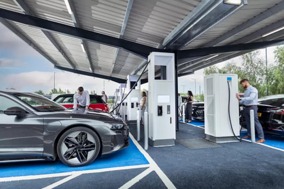
GM and electric vehicles, this is where the new logo comes in. According to General Motors they are "debuting a new marketing campaign as part of the company’s comprehensive efforts to accelerate mass adoption of electric vehicles. The 'Everybody In' campaign is a call to action meant to reflect a movement that’s inclusive and accessible. The company is also evolving its brand identity as GM transforms itself to deliver on a vision that creates a world with zero crashes, zero emissions and zero congestion."
According to the company here's what the new logo represents:
The new GM logo features a color gradient of vibrant blue tones, evoking the clean skies of a zero-emissions future and the energy of the Ultium platform. The rounded edges and lower-case font create a more modern, inclusive feel. The underline of the “m” connects to the previous GM logos as well as visually representing the Ultium platform. And within the negative space of the “m” is a nod to the shape of an electrical plug.
Ultium by the way is the platform that will be the foundation for the next generation of General Motor's electric vehicles. Everything from their high performance vehicles, to I suppose what will be the electric vehicle equivalent of Chevrolet's Cavalier.
As gas prices climb to near $2.00 a gallon, and putting 300 miles on my vehicle every week between Sedalia and Warrensburg, I'm all for electric vehicles. Especially if automakers like General Motors can produce and sell them for the same price as regular vehicles.
If a redesigned logo gets us to think about a future with zero emissions and not having to give big oil our money, I'm all for it. That said, I'll still miss the classic logo that's been a big part of my life. I'm not too worried though. I'm sure I'll always be able to buy the old logo on a T-shirt.
KEEP LOOKING: See what 50 company logos looked like then and now

More From Mix 92.3